Favorite 2019 Book Covers (So Far)
We’re often told, by impassioned librarians and insistent bibliophiles, to never judge a book by its cover. While it’s true that the most stylishly packaged novel can reveal poorly written language lacking in substance, we certainly should not write off book covers as mere fluff with only the potential to mislead. In fact, book covers, when done well, can illuminate themes and connections between motifs. They can distill larger ideas into a single striking image, or perhaps simply evoke the book’s overall tone. They might hint at some aspect of the story that readers will only appreciate after turning the final page.
Beyond exemplifying the book at hand, the best book covers should also provoke and surprise on their own. As books are increasingly being purchased and read on digital devices, the aesthetics of the book as physical object might matter more. Considering the thoughtful work put in by designers, physical books seem to do covers more justice. Well-designed books can, after all, persuade readers to purchase a physical, i.e., more expensive copy over its e-reader edition. Many bibliophiles understand the pleasure of a book’s physicality, especially one that looks as great as the story within reads. Indeed, a book can also, on some level, function as a humble objet d’art to be shown off on the shelf, coffee table, or Instagram. And, with the ever-constant flow of shared images on social media and advertisements, a successful book cover should grab our attention and, ultimately, sell.
Below is a neither exhaustive nor impartial list of the best book covers of 2019 so far, chosen for their ingenuity in representing what lies between the books’ pages as well as for their aesthetic pleasure. You’ll want these on your shelf.
 Emily Skaja
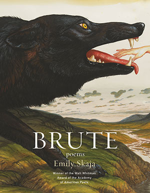
Brute
Graywolf
Design by Mary Austin Speaker
Cover art by Walton Ford, Gleipnir
This visceral cover designed for Emily Skaja’s equally visceral collection of poems is difficult to turn away from. Playing with scale and color, the lush backdrop gives way to a gargantuan wolf in the foreground. The text is unassuming in font and size, and yet the title, in all caps, looms with a sense of finality. The gingerly placed hand, suspended in a moment of uncertainty, is both menacing and whimsical in tone, both dark and optimistic—akin to Skaja’s poetry.
 Yōko Ogawa
The Memory Police
Trans. Stephen Snyder
Pantheon
Design by Tyler Comrie
Combining photography with sketch, this portrait-based cover for Ogawa’s The Memory Police intrigues at once and evokes the Orwellian, surrealist quality of this fable about the power of forgetting and remembering and the gaps in between. The contrast between dark blues and bright oranges catches the eye. Brilliantly, the design of the author name and book title is reminiscent of a police badge and is suggestively placed over the subject’s eye.
 Hanif Abdurraqib
Go Ahead in the Rain: Notes to A Tribe Called Quest
University of Texas Press
Design by Sunra Thompson
The gradient color elements of the text are only part of this book cover’s draw. Its excessive straightforwardness is both informative and heartfelt, characteristic of Abdurraqib’s work, a critical biography and memoir on the seminal rap group A Tribe Called Quest. Blending personal narrative with cultural criticism, the author approaches his work with humility and generosity. Riffing off the cover for a Black Keys album, which is riffing off a Howlin’ Wolf album cover, Abdurraqib’s book pays homage to music and its transformations over time, and the possible chain of connections made between listeners.
 Adam Ehrlich Sachs
The Organs of Sense
Farrar, Straus and Giroux
Design by Alex Merto
Adam Ehrlich Sachs’s The Organs of Sense begins in 1666, when an astronomer predicts a solar eclipse will cast Europe in darkness for four seconds—but this astronomer is known to be blind, mysteriously having had his eyes plucked out. The incredible bold green of this simplistic cover is initially arresting. In addition to the clever use of cut-out stars to symbolize the astronomer’s blindness, the collage cover feels cheeky in tone, suggesting the absurdity and joyfulness of Sachs’s comic fable.
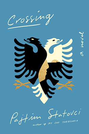 Pajtim Statovci
Crossing
Trans. David Hackston
Pantheon
Design by Tyler Comrie
Pajtim Statovci’s Crossing tells the story of two childhood friends who decide to leave communist Albania for a chance at self-discovery in Italy. Crossing explores themes of gender, sexuality, and foreignness and incorporates Albanian myth and legend. The bright blue of the background contrasts nicely with the intricate, mythic illustration in the foreground, which, on its own, reflects the themes of duality, journey, and identity inherent to Statovci’s layered work.
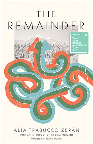 Alia Trabucco Zerán
The Remainder
Trans. Sophie Hughes
Coffee House Press
Design by Tree Abraham
Quietly understated in color, the cover design for The Remainder blends artistic mediums to aptly portray key aspects of Alia Trabucco Zerán’s work. In modern Santiago, the story follows three friends, symbolized by the three swirling arrows, as they undertake a journey up mountains to confront both literally and figuratively the generational pain left in the wake of Chile’s dictatorship and their parents’ militant pasts.
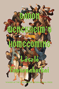 László Krasznahorkai
Baron Wenckheim’s Homecoming
Trans. Ottilie Mulzet
Tuskar Rock Press
Design by Harry Haysom
The cover for László Krasznahorkai’s Baron Wenckheim’s Homecoming is as conspicuous and turbulent as the sprawling, absurd tale inside. Set in contemporary times, the novel follows Baron Wenckheim, an idealistic protagonist who, at the end of his life, returns to his provincial Hungarian birthplace looking to rekindle a childhood romance. What follows is a storm of scheming characters, gossip, and spectacles, implied by the cover’s medievalesque illustration of scrambling bodies that are either euphoric or treacherous. Perhaps both. The lime-green text is, of course, fabulous.
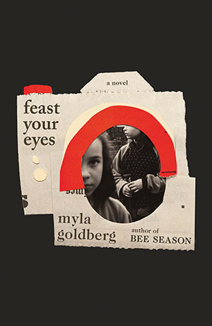 Myla Goldberg
Feast Your Eyes
Scribner
Design by Lauren Peters-Collaer
Deftly using collage, the cover for Myla Goldberg’s Feast Your Eyes readily implies elements of the book’s plot, themes, and narrative devices. As the collage suggests, this work is pieced together and fragmentary. Set in New York City from the 1950s to the 1970s, Feast Your Eyes confronts the struggle between art and motherhood, as photographer and mother Lillian Preston is caught up in a national scandal for her graphic artwork. Goldberg recounts the story through fragments: catalog notes from a photography exhibition, journal excerpts, letters, interviews, and her daughter, Samantha’s, reflections.
More by Kayla E. Ciardi


Autumn 2019
World Literature Today’s autumn issue celebrates U.S. Poet Laureate Joy Harjo with poems and an interview inside, and the cover feature devoted to Literary Activism commemorates the 50th anniversary of the Alcatraz occupation that began in November 1969, guest-edited by Allison Hedge Coke. As always, a generous selection of book reviews and other features round out the issue.
Table of Contents